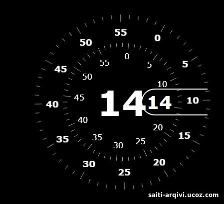
<!DOCTYPE html> <html lang="en" > <head> <meta charset="UTF-8"> <title>Analog CLock</title> <style> @import url("https://fonts.googleapis.com/css2?family=Comfortaa:wght@300;400;500;600;700&display=swap"); *, *:afater, *:before { box-sizing: border-box; } body, html { background: #000; margin: 0; height: 100vh; color: #fff; font-family: "Comfortaa", cursive; } .clock { --clock-size: 360px; width: var(--clock-size); height: var(--clock-size); position: fixed; inset: 0; margin: auto; border-radius: 50%; } .spike { position: absolute; width: 8px; height: 1px; background: #fff9; line-height: 20px; transform-origin: 50%; z-index: 5; inset: 0; margin: auto; font-style: normal; transform: rotate(var(--rotate)) translateX(var(--dail-size)); } .spike:nth-child(5n+1) { box-shadow: -7px 0 #fff9; } .spike:nth-child(5n+1):after { content: attr(data-i); position: absolute; right: 22px; top: -10px; transition: 1s linear; transform: rotate(calc( var(--dRotate) - var(--rotate))); } .seconds { --dRotate: 0deg; --dail-size: calc((var(--clock-size)/ 2) - 8px); font-weight: 800; font-size: 18px; transform: rotate(calc( -1 * var(--dRotate))); position: absolute; inset: 0; margin: auto; transition: 1s linear; } .minutes { --dail-size: calc((var(--clock-size)/ 2) - 65px); font-size: 16px; transform: rotate(calc( -1 * var(--dRotate))); position: absolute; inset: 0; margin: auto; transition: 1s linear; } .stop-anim { transition: 0s linear; } .stop-anim .spike:after { transition: 0s linear !important; } .hour { font-size: 70px; font-weight: 900; position: absolute; left: 50%; top: 50%; transform: translate(-50%, -50%); } .minute { font-size: 36px; font-weight: 900; position: absolute; background: #000; z-index: 10; right: calc(var(--clock-size)/ 4.5); top: 50%; transform: translateY(-50%); } .minute:after { content: ""; position: absolute; border: 2px solid #fff; border-right: none; height: 50px; left: -10px; top: 50%; border-radius: 40px 0 0 40px; width: calc(var(--clock-size)/ 2.75); transform: translatey(-50%); } </style> </head> <body> <second class="clock"> <div class="seconds"></div> <div class="minutes"></div> <div class="minute">44</div> <div class="hour"></div> </second> <script> const seconds = document.querySelector('.seconds'); const minutes = document.querySelector('.minutes'); const minute = document.querySelector('.minute'); const hour = document.querySelector('.hour'); // Create spikes for(let s = 0; s < 60 ; s++){ let mSpikeEl = document.createElement('i'); let sSpikeEl = document.createElement('i'); mSpikeEl.className = 'spike' sSpikeEl.className = 'spike' mSpikeEl.style = `--rotate:${6 * s}deg`; sSpikeEl.style = `--rotate:${6 * s}deg`; mSpikeEl.setAttribute('data-i', s); sSpikeEl.setAttribute('data-i', s); seconds.append(sSpikeEl); minutes.append(mSpikeEl); } function getTime() { let date = new Date(), s = date.getSeconds() , m = date.getMinutes(); hour.textContent = date.getHours(); minute.textContent = m; minutes.style = `--dRotate:${6 * m}deg`; if(s == 0){ seconds.classList.add('stop-anim') } else{ seconds.classList.remove('stop-anim') } if(m == 0){ minutes.classList.add('stop-anim') } else{ minutes.classList.remove('stop-anim') } seconds.style = `--dRotate:${6 * s}deg`; } setInterval(getTime, 1000); getTime(); </script> </body> </html>


